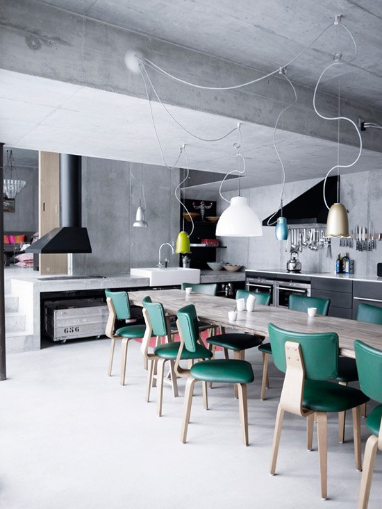
Decor keys and decorator secrets to get more out of the space, and also make it look bigger. Is your living room well distributed? Do you think it can improve? To have a clearer answer, look at these examples. Discover some deco keys and decorator secrets to get more out of your space, and also make it look bigger.
WITH CHIMNEY
 Living room with fireplace
With a classic and super elegant mouthpiece or with a more modern and discreet one … Fireplaces add style to any living room. The usual thing is to distribute the living area around it, when they occupy the central space of the wall, and, above all, to enhance the section of wall where they are located with a mirror, a painting or a composition created with plates and photographs. If you have a shelf, a collage with candles, chandeliers, flowers …
THE WINDOWS HAVE CHARM
 Living room with window
The windows beautify the rooms. Distribute the room taking into account where they are and their proportions, and thus you will make them and their surroundings stand out. They almost always form an irresistible tandem with an armchair to create a reading corner or with a chaise longue …
Panoramic windows deserve a separate chapter, as in this living room . The distribution of the furniture in the living area should be done thinking about enjoying the landscape and views they offer.
WHAT DO YOU WANT TO HIGHLIGHT?
 Classic style living room
Think about which piece of furniture, wall or corner you want to make it stand out the most. That is the starting point. The rest of the furniture and accessories will revolve around him. For most it will be the sofa, but it can also be the duo sofa and coffee table, a vintage sideboard , an antique furniture or a work of art. In this living room , one wall was elegantly toned to enhance Riccardo Neri’s photography, but all the furniture in the living area gains visual interest. Interior design, Luis Puerta.
WHEN THE KITCHEN IS IN THE LIVING ROOM
 Living room with brick wall and built-in kitchen
Living rooms with kitchens are a trend, but not everything goes. Key in the distribution: keep your own space for the living area and another for culinary tasks. Fundamental. Quite a challenge when the room is not very big. This example and your ideas can be applied in other small rooms. The environments are delimited by the change in the coatings: exposed brick and white walls. The sofa is corner to optimize space and make circulation more fluid. The transition element between the living room and the kitchen: an island that acts as a dining table and extends the worktop surface. If your living room shares space with the kitchen, remember that its aesthetics must be impeccable.
LIGHT AND PERSPECTIVE
 Modern living room with fireplace
An accurate distribution: the most voluminous furniture occupies opposite walls to gain visual depth, and make the terrace become one more room in the living room. And a practical solution to gain storage areas in the living room: a piece of furniture like the one in this example , with smooth doors and a large capacity.
The feeling of spaciousness in the living room is also created when the entry of natural light is favored and this is enhanced by light colors. The trick for a dazzling effect: the contrast with a darker tone makes the white intensify, as it was done in this room.
A WHOLE CLASSIC
 Modern living room with fireplace
Symmetric distribution is one of the most used resources by decorators. There must be a reason. It transmits order and serenity. Playing with symmetries in a corner of the living room is also synonymous with elegance. In this room it was made around the fireplace, flanked by two sideboards, by More & More. Above it, the Rondo mirror , by Zieta. And on the walls, two old doors, recovered from the house, which were lacquered by Carpintek with a Dimensi-on design. The deer head was purchased from El Collage. Interior design, from the Dimensi-on studio.
WHEN THERE IS A PILLAR

In rooms with pillars, the distribution of the furniture is complicated, but there is always a solution. In most cases, the pillar becomes the element that marks the border between two environments, as was done in this room . The pillar, between the two armchairs, closes the living area, and indicates the passage area to the dining room. Perfect, the idea of turning it into a first-rate decorative element with the color mustard.
In other rooms, the pillars can be integrated into the decoration, if they are part of a custom-made piece of furniture, such as a shelf of greater or lesser height.
WITHOUT PARTITIONS
 Open living room
The classrooms are extended many meters if unnecessary partitions are demolished and various distribution options are studied. In this room, the furniture delimits the environments, as shown by these two images of the same room.
The feeling of spaciousness was achieved by removing the partitions and unifying the living room, hallway and dining room. The only element that was not removed, for architectural safety reasons, was the central pillar, which was integrated into the decoration thanks to the low wall that separates the living area from the dining room, located at the back. The wall was also extended as a side of the bookcase: a design by the interior designer Sagrario Escribano in white lacquered MDF. The back part of the wall, which integrates the pillar, was used with a low bookcase with the same finish as the design made on the wall of the living area.


