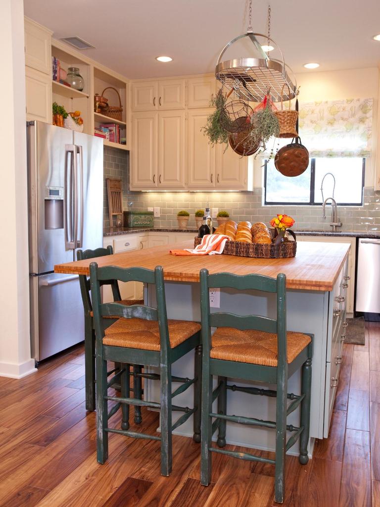
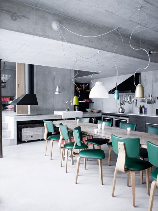
The decoration experts explain to us what are the keys to having the perfect dining room, under the premises of organization, class and personal style. The dining room becomes a place to enjoy, where time stops between laughter and gatherings. There are many ways in which we can design interiors and thus achieve an appearance that conforms to our personality. Therefore, we are going to know 12 keys to have the perfect dining room according to the decorators.
Generally, we want every room in the home to have its charm. The fact of arranging furniture, color and curious shapes give the space a special character. However, the situation can arise in which we stagnate with ideas or do not know how to proceed, especially if spaces are combined, as in kitchens with dining rooms.
HOW TO DECORATE THE DINING ROOM?

Interior design professionals explain that, in order to achieve an acceptable decoration and to everyone’s taste, it is important to be clear about the ideas that are intended to be achieved. The materials, shapes and style must be to our liking. It is useless to live in an environment that does not represent us or that is decontextualized with respect to the style of the rest of the home.
Something fundamental that we must take into account is the situation of the dining room. It should be located in a bright and spacious place. Typically, dining rooms are the common trend, so the table and seats should follow similar patterns. In this sense, formality or informality are the paths to follow, that is, depending on the type of furniture, this will be the style that we define in general.
EQUIP THE DINING ROOM
Comfort becomes an essential concept. Decorators recommend that, to set up a dining room according to the available space, we must feel fully at ease. To do this, you do not have to complicate your life and equip the dining room with those resources that provide comfort: a large table, padded chairs, a sideboard, a waitress on wheels, etc.
It is worth investing in quality furniture. Wood, glass, or metal tables are the best options. Everything is a matter of presenting them with a curious shape and a neutral color that does not stand out excessively. The same can be said of the chairs, where those with basic lines, in wood or polypropylene, and with neutral tones look very good.
When decorating the dining room, the ideal is that we have clear ideas. Sometimes it is not necessary to complicate our lives, we simply have to choose those elements that are useful, functional and aesthetically attractive. After all, there are dining rooms of all styles. Take a look at these 12 proposals that the experts make us and renew the image of the dining room!
1- RECTANGULAR SHAPE
 Dining rooms
According to the Backsteen study, a table with this shape identifies the host and his guests. It shows a more classical language and, even, with a certain baroque style in the legs; However, a certain modernity opens up through the chairs that maintain a similar chromaticism with the table.
2- ROOF WINDOW

And what happens when the dining room is located indoors? Well, we can bring natural light through a roof window – as the Espacio Acorde studio projected in this image – or through a reflective solar tube. The Velux firm is specialized in both systems.
3- DIFFERENT CHAIRS

We have always done it: bring models from other rooms when more guests are added. Well, today interior designers make this variety permanent to break the monotony and recreate environments that reflect bustling meetings, full of life. Eulale table, extendable from 125 to 260 cm; and chairs: Cedak with blade back, Notingham with mesh medallion and Inqaluit , white and with rods.
4- ELEMENTS THAT DELIMIT

The loft-style layout, without walls, makes the house appear more spacious. Here, Meritxell Ribé, from The Room Studio, used different resources to indicate the space that corresponds to the dining room. It is considered a kitchen with a dining room but separated by a wall. The rug, with the poufs aligned with the sofa, is the border where the living area begins. The dining room occupies the space between the two. Thus, to better indicate their location, the ceiling lamps are centered on the table and this is placed perpendicular to the sideboard.
5- WITH SUBTLE DIFFERENCES
 Wooden dining room with different chairs
Although at first glance these seats seem different, if we look closely we see that most are the same model, but in different colors. Alternating finishes invigorates the space without breaking the harmony. Industriell Collection, by Ikea: chairs, bench and table.
6- EQUAL

Equal chairs convey balance. For harmony to reign, add some other element of the dining room to match its finish. Here, the striped wallpaper harmonizes with the upholstery. From Laura Ashley: Addington chairs, upholstered in greenish-gray Dalton fabric; Milton folding table and Cornish Stripe paper roll).
7- BASIC TIPS

For the dining room to be bright, it should be located as close as possible to windows and glass enclosures. Mirrors are also important since, as Emmme Studio explains to us, “they multiply both the light and the feeling of spaciousness”. Other factors that contribute to adding luminance are light coatings. If you realize it, this dining room, decorated by Paula Duarte, uses all these resources.
8- CRYSTAL, THE SOLUTION

If the dining room has a glass enclosure instead of a wall, the environment will be brighter. This concept is worked out by the Santos Miguelena studio: substituting a wall for a structure with white lacquered wooden profiles -luminous in themselves-, with glass panels and two doors in the center.
9- IRREGULAR LINES

Nordic style dining room
Is it possible for a table to be neither oval, nor rectangular, nor square, nor round? In this Nordic-style dining room, the space seems more uncluttered and the decor is energized. The key is that its corners are rounded to avoid bumps and soften the design. Jimi Collection, from La Redoute Interieurs: table; chairs and armchair.
10- A CLASSIC: THE SIDEBOARD

In addition to its internal storage capacity , keep in mind that the surface offers extra space to display the coffee set on a tray, or the ice bucket. Suri model; measures 140 x 40.3 x 81 cm.
11- GEOMETRIC PATTERN

Tables with traditional lines also have their positive aspects. For the experts at Emmme Studio, the rectangular and square ones are functional and facilitate the possibility of adding one more table. As for the circular and oval ones, they are cozy, social and comfortable by not having annoying corners or legs. Like this inherited table that, surrounded by colorful designer chairs, invites to get together.
12- WAITER WITH WHEELS

An excellent support surface to avoid cluttering the table. From the firm La Redoute Interieurs, waitress on wheels, in 66 x 33 x 87 cm.


