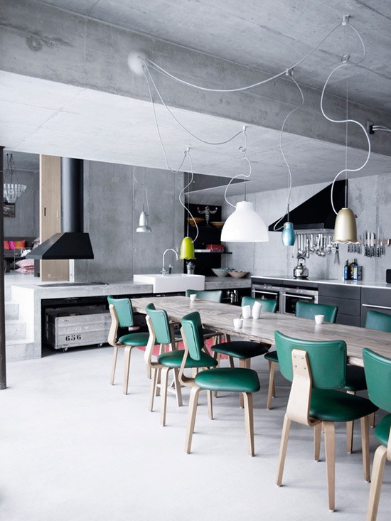
There are a few tricks that can make your corner look much bigger than it is. The first step is to avoid these mistakes in decoration! Nobody wants to make a small room look even smaller than it already is, right? To prevent this from happening, there are some small mistakes in decoration that can be avoided when planning or renovating your home.
By following a few clever tricks, you can make any room look more spacious and give your home or apartment greater visual breadth. Check out!

Mistakes made in decorating small spaces

Dark walls:

By using dark tones on the walls, you take away the softness of the environment and bring the impression of a reduced space. Also, as with clothes, the dark absorbs light from the room and makes the room appear smaller.
Lack of planning:

You know that beautiful sofa you saw in the store and it looks perfect for your little corner? Before buying, you need to make sure that the furniture is the right size for the available space. When possible, it is ideal to invest in custom planned items.
Lots of furniture:

The more furniture in the same room, the less space available for circulation. This is a very common decorating mistake, especially in the living room. Therefore, the tip is to distribute these objects throughout the house and, if possible, try to unite the internal and external areas.
Poor lighting:

A good lighting design makes all the difference in the amplitude of the environment. The tip applies to both artificial lighting and natural light. So, invest in good chandeliers, lampshades and spotlights . Another good idea is to bet on LED strips on furniture.
Objects “glued” to the wall:

It may not seem like it, but this is a very common mistake and it totally interferes in the decoration of small spaces. This is because, the closer the walls are to the furniture, the greater the feeling that the maximum space limit has been reached. So, it’s worth moving these items away from the walls to achieve greater visual depth.
Exaggerated decoration:

Especially in small spaces, the tip is to bet on the famous motto “less is more”. The excess of decorative items, including paintings, shelves or oversized ornaments brings the feeling of a messy and visually polluted environment. Therefore, it is best to bet on a more delicate and minimalist style.
Small curtains:

Fabrics that are too short interfere with the impression of height of the house and create a lower ceiling than it actually is. So, to enhance the vertical of the place, the correct thing is that the length of the curtain goes to the floor.
So, did you make any of these mistakes in decorating your small space? So take advantage of the fact that some of them are very easy to correct and ensure more spaciousness and comfort in your corner.


