Clean is a trend, making any environment look bigger and brighter. Perfect for the kitchen!
Those who choose to design a clean kitchen at home have numerous advantages. This style ensures a modern aesthetic and optimizes space, meaning it makes a small room look bigger. On top of that, the task of cleaning the room every day becomes much easier and more functional.

Some people like a very busy environment. For some time, there was even talk of maximalism , the complete opposite of minimalism, where people have large collections of furniture and objects. It may not look like it, but it’s easy to become maximalist in the kitchen: a pot here, a pot there, a bunch of pans and when you see it there’s no space and what was once decor on charming Pinterest- worthy exposed shelves.
In the kitchen, maximalism is a style of decor that easily becomes a mess. In opposition to this concept, we find the very modern clean kitchen. From English, clean means clean – and cleanliness, mainly visual, is something that this type of environment has plenty of. Want to know how to have one at home? Come with us:
Clean kitchen to have at home

A modern, minimalist kitchen must be Marie Kondo’s passion, the Japanese made famous with a book on organization and a series on the Netflix streaming platform, with her organized perfection. In a way, the clean is considered minimalist, as it values the visual lightness of the environments.
The space doesn’t have many things scattered around, including decoration accessories, with a light and soft color palette and emphasis on the coverings, mainly natural stones and light wood.
Why choose the clean style?
One of the best advantages of adopting the style at home is that this visual cleanliness gives the impression that the rooms are larger. With less furniture and objects occupying the view, the decor has breathers for the eye and even a small room seems spacious. If that’s the case in your home, the clean style might be right for you.

In addition, with fewer objects, we make all cleaning processes easier . This is a nice benefit for the kitchen, which is exposed to smoke from cooking and grease spills. Minimalism also cuts down on the mess, after all, there’s not so much to mess up!
Clean Color Palette
Clean kitchens have a very specific color palette. As the intention is to provide a clean and organized atmosphere, white is the tone that most appears in the projects. Being a neutral, it doesn’t tire the look and can appear in abundance. Also, it has its undertones.
Even if the changes are smooth, it is possible to bet on pure white, vanilla, ice, ivory, bone, beige… this variation between creamy, sandy, glossy and matte paints and coatings is capable of transforming the kitchen by its details.

Pastel shades like pink are also welcome. Everything is very clear, to keep the space with a feeling of spaciousness and light.
Last but not least, wood or coatings that imitate it, such as porcelain. The clean borrows the preference for lighter Scandinavian-style woods . As it is a warmer shade than whites, it represents the coziness factor needed in an environment like the kitchen, where everyone gathers around.
It’s not that common, but those who like to be daring can even put black in the modern , minimalist kitchen . Usually as a focal point on a balcony or island.

Materials
If white reigns in this type of environment, how can you make it unique and with personality? The answer is easy: betting on materials rich in different shapes, textures and finishes!
Among the darlings for lovers of clean kitchens are natural stones, especially marble . Each one with special characteristics, natural veins and stains and unique among themselves, this noble raw material guarantees the look of the space. It can appear wherever the imagination dictates: on the bench, on the island, on the floor, as a detail on the furniture and even on the walls.

The same happens with wood, which can be used in cabinets or restricted to the floor, where it is more popularly found. Organic materials in general look good in a visually clean environment, as they bring with them the harmony of nature.
In addition to these, it is also common to find kitchens with white bricks or subway tiles. The glossy, treated finish ensures that food preparation splashes do not stain the pieces and add a retro charm to the home.

Glass is another ally for transforming a kitchen into a clean space, especially for cabinet doors or the backsplash.
Furniture and accessories: how many and which ones to have?
No, having a clean kitchen does not mean giving up most of your belongings, minimizing cabinets and using only the sink countertop. Both small and large, just like any kitchen it can and should be well equipped – with both overhead and floor cabinets, central islands that help the resident to attack from chef from time to time, stools, pendant lighting and the like.

The secret is actually in the visual balance between quantities, shapes and colors. Most of the time, just to make sure, we see these kitchens betting on straight shapes , white and closed cabinets, for example. But nothing prevents the clean environment from having one or another curve, or from having open shelves or glass cabinets displaying some bowls and glasses.
The point is that everything is very functional. To design a clean kitchen, therefore, the ideal is to bet on planned or made-to-measure furniture. The sets available on the market guarantee a mix of beauty and utility.

Clean doesn’t mean empty either, so it’s okay to have a shelf or two with pretty dishes as a decoration. The same goes for homemade vegetable gardens, whether vertical, in pots on the shelves, or in metalwork solutions. They are a charm and green is always a good choice for any room in the house!
Home appliances cannot be lacking either. Prefer stainless steel ones, with a modern look. Especially the stove, ensuring cleanliness, as the whites leave oil and grease stains more evident. So there’s no mistake!
kitchen inspirations
Now that you know the ABC of the clean kitchen, there’s only one thing left: check out several examples and find out what makes them a success, to get inspired and bet on the trend once and for all.

All white, without marble, bricks or sparkles in the appliances. The secret to the success of this truly minimalist kitchen was the wooden drawers. The species used has characteristic veins and stains that diversify the decor, giving the long bench the elegant highlight it deserves.

Among the clean style jokers, the resident also bet on metallics in this kitchen. An aged gold appears at the feet of the stools and sconces.

When there is space, it is possible to create special corners in the kitchen. In this case, a cutout of the counter, between two doors, became a small bar with a wine cellar – keeping the visual unit clean, focused on white and stones.

In this house, the kitchen couldn’t take up much space. To save money, the countertop of the sink and coffee maker is in a niche between cabinets. All white, with straight, simple lines.

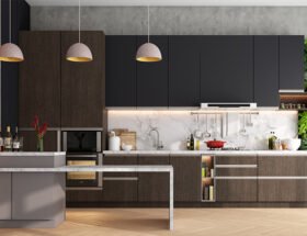
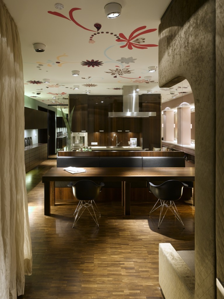
Even with the darker wood, this kitchen’s simplified and minimalist design leaves no doubt: it’s clean!

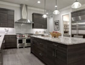
We say that black can also be part of this style and it’s too late to go back. To balance the lower cabinets in black , the option was for white walls covered in stone, a hood surrounded by a white structure and very few upper cabinets in the same shade.

The stone from the bench extends over a section of the wall. It doesn’t end abruptly: before giving way to the ink, it changes orientation again, forming a charming little shelf.

Unusual, the wooden countertop was beautiful in the minimalist kitchen.

The wall below the cabinets is covered with glass. Brightness gives great effect with built-in lighting.

Do you have doubts about whether or not to bet on the clean style for small kitchens? Leave them alone and immerse yourself in the trend. The combination of colors and materials, in addition to the organization, makes the environment seem larger and emphasizes light.

The icing on the cake in this kitchen are the niches in the wall, the same shade as the cabinet.

A suspended piece of furniture brings the feeling of double lightness, taking up less space in the field of vision.

Small clean kitchen, sharing space with a dining room where wood is the protagonist.

To integrate the kitchen and living room, the choice was for a hollow countertop, which does not obstruct the view between rooms.

One of the reasons for the clean trend is the way white reflects natural light , making the environment look bright and well lit during the day.

The balance of colors and textures makes the kitchen unique.

Modernity goes hand in hand with style. In this environment, it appears in appliances, such as the built-in oven and cooktop, both minimalist technologies.

Corridor type, the kitchen combines a wooden countertop with a suspended dining space.

Why not bet on marble to cover a complete wall?

A kitchen that looks like it’s all set up with a ruler! The square wall cladding completes the straight precision of this Scandinavian-inspired room.

Cabinets with a glossy finish guarantee the lightness of the space, allowing for an unusually decorated floor and black wall.

To cut the white without giving up the light look, residents opted for a relaxed shade of gray on the exposed walls.

The minimalist shelves in this kitchen don’t hide the utensils, but they also don’t show various objects.

A white and wooden kitchen: synonymous with simplicity and elegance.

Lacquer cabinets ensure a clean, modern aesthetic.

Clean, all white and futuristic kitchen.

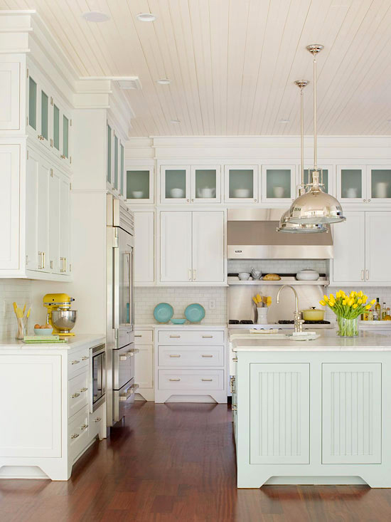
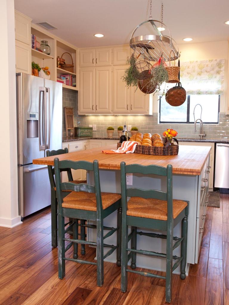
A clean kitchen with an island is what many people want, after all, the environment offers functionality and modern design.


